

LIFE IN HIFI is an active lifestyle brand tailored around engaging people with the passions they care about.
Working along side creative director Josh Hoye and the owner Winder Hughes, I was one of two creative directors hired to develop the brand as a whole. Specifically, as the user experience director, my focus was to craft and design an eCommerce website that would sell our apparel lines. I also provided consultation and art direction for logo development, brand guidelines and business strategy.
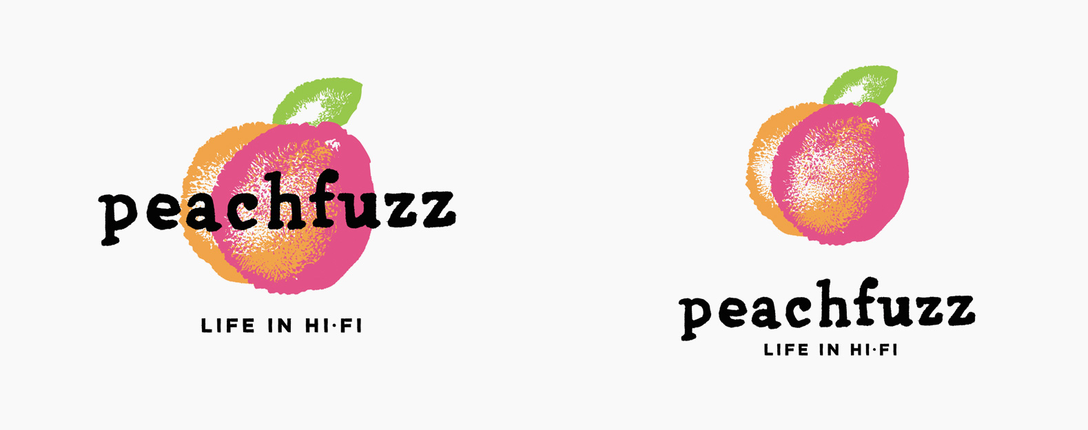
Initially, the brand name and mark began as Peachfuzz, which was focused more directly on selling apparel.
All three of us wanted to develop a truly recognizable mark so we choose to hire a branding agency called Matchstic. Josh Hoye and I gave direction around what we were looking for in the brand mark and why.
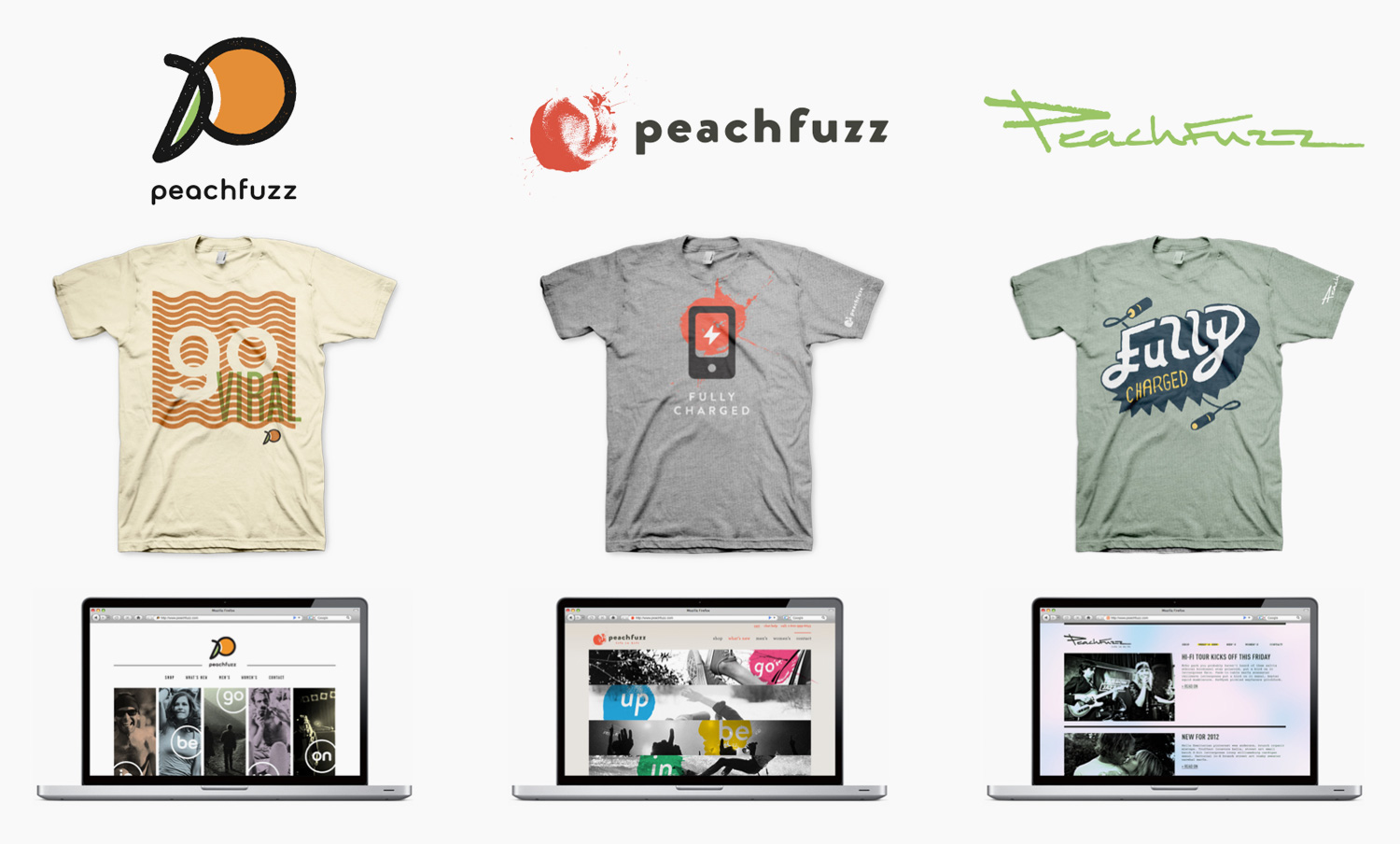
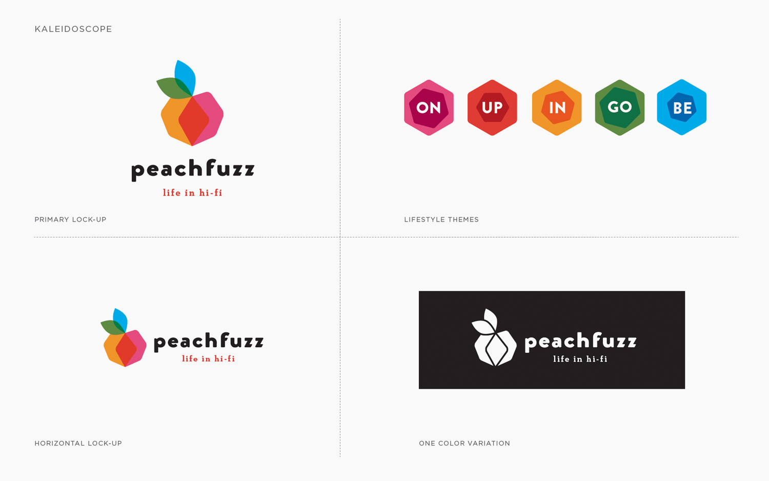
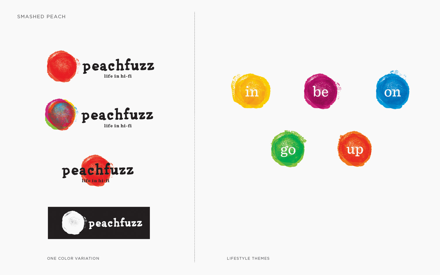
We really liked the idea of the smashed peach, however, we wanted to explore some variations of it. We also wanted some phrases associated with the brand, something that could tie the brand together as one. A brand about passions and lifestyles. Together, we came up with On, Up, In, Go, Be.
We wanted to see two semi-final variations of a possible brand. A clean modern look and an edgy sporty look, a brand with a story to tell.
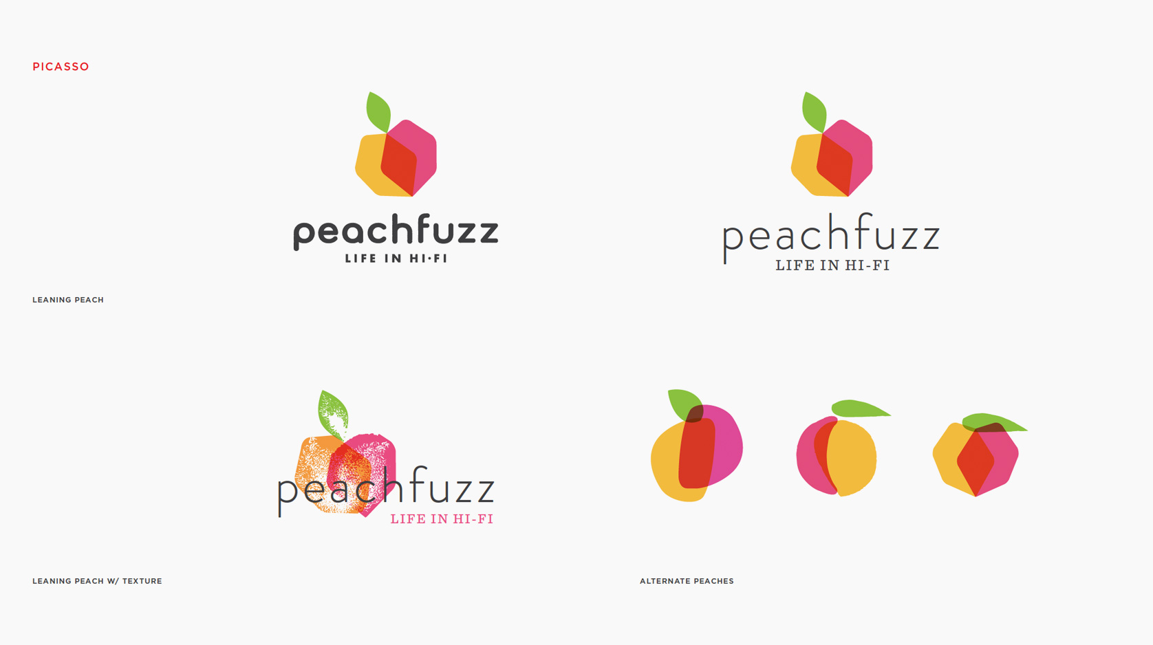
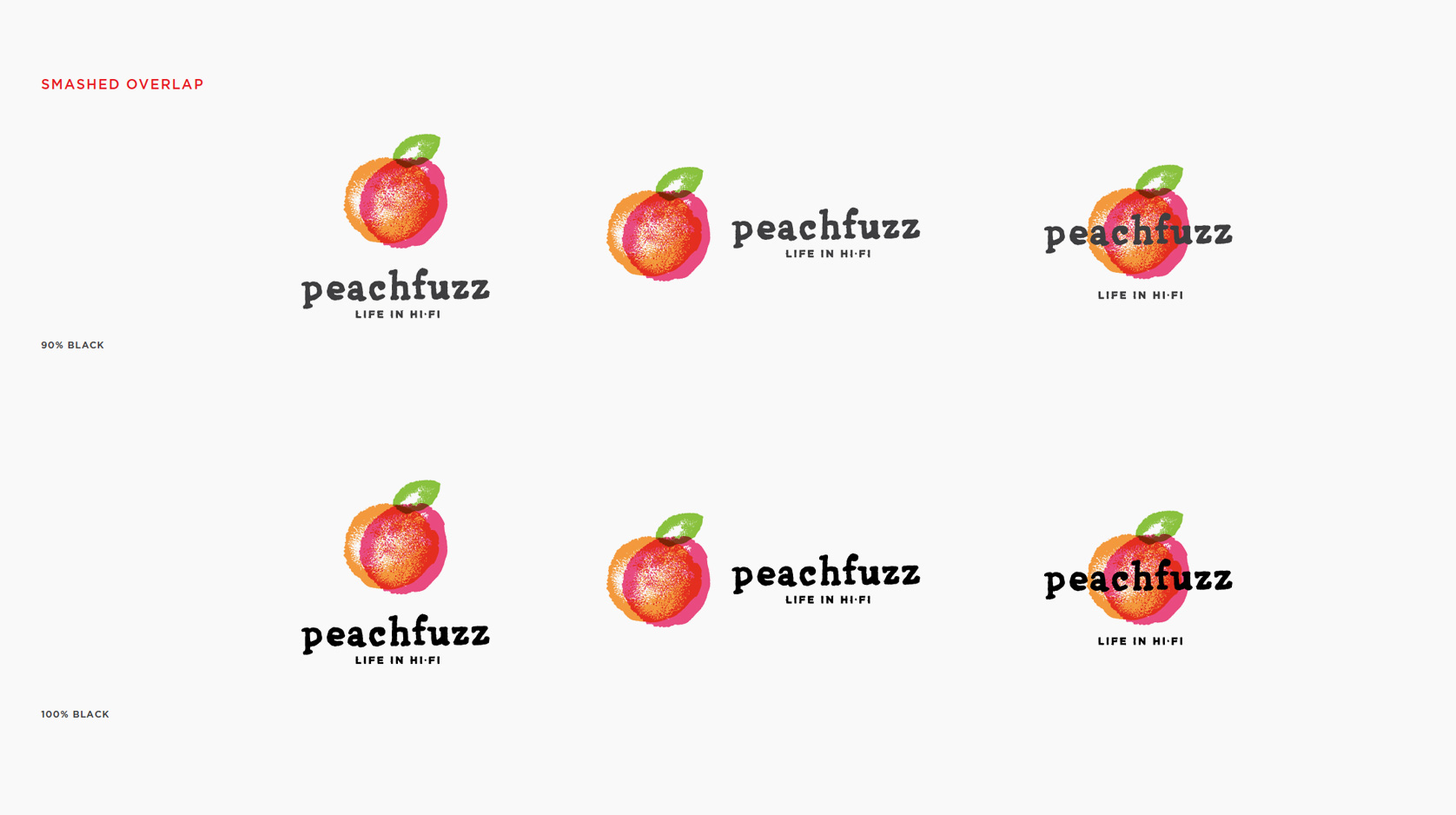
Unfortunately, we felt the modern look resembled Apple and we didn’t want to be confused with that brand, so we finally selected the mark that was us. A brand with a story to tell. It was the perfect mark that combined the elements of both an active lifestyle and a digital presence.
Once we settled on a brand mark, I set off concepting the website.
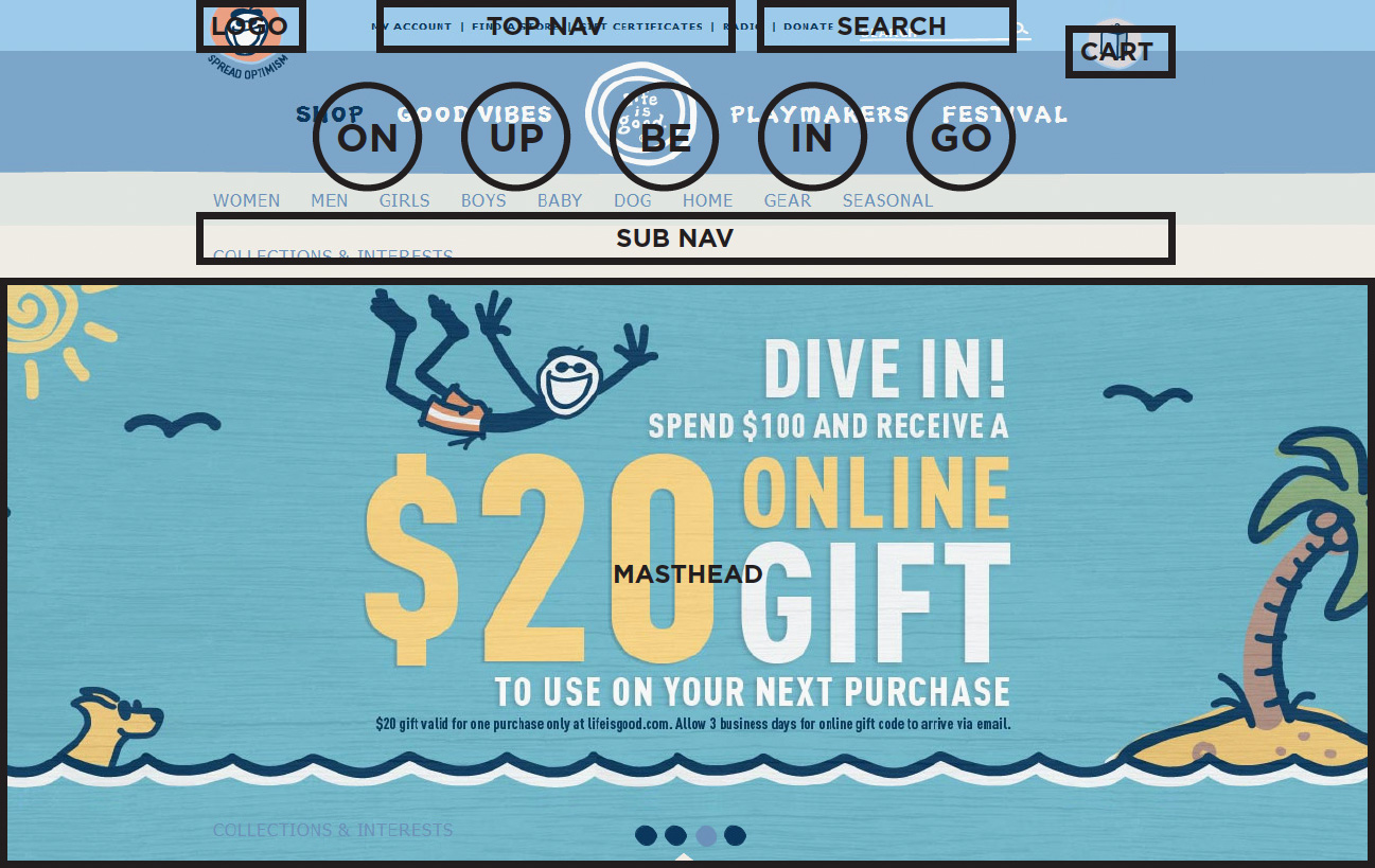
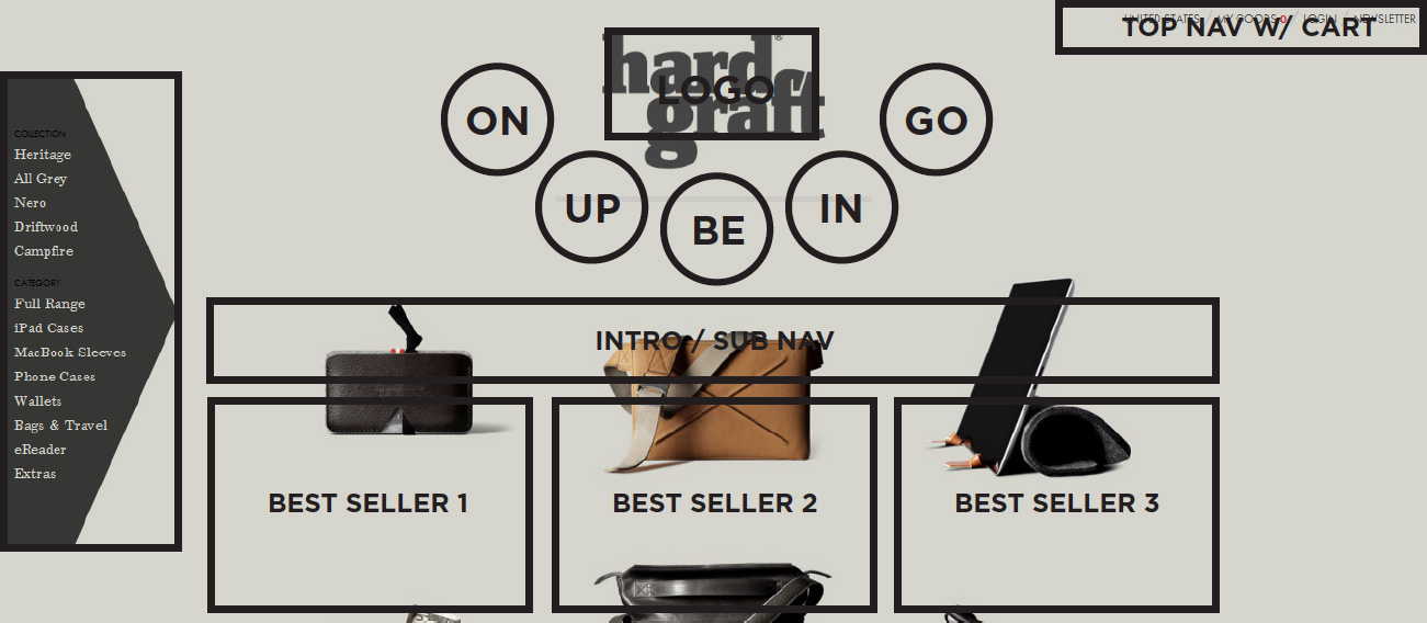
I began with a comparative and wireframe analysis. I really loved the look and user experience of Life Is Good. It also played well with our brand, given we were very much about a lifestyle. I also used other examples, looking specifically for navigation schemes and treatments towards various user actions. Hard Graft was another site I really liked the feel of.
We tried hiring an agency to develop some eCommerce wireframes, however after a few meetings, we abandoned the idea. The site was going to be larger than just an eCommerce experience, however we were not yet sure as to what extent that would be.
Next I started designing the landing page, since Winder, the owner, preferred semi-finished comps. One of the many obstacles for me, beyond user-experience, was choosing a font that was both distinguished yet fun enough to compliment our brand mark. Matchstik had chosen Gotham as the brand font, however, that really didn’t do the trick for us.
We tried a few fonts. One such font was Montara.
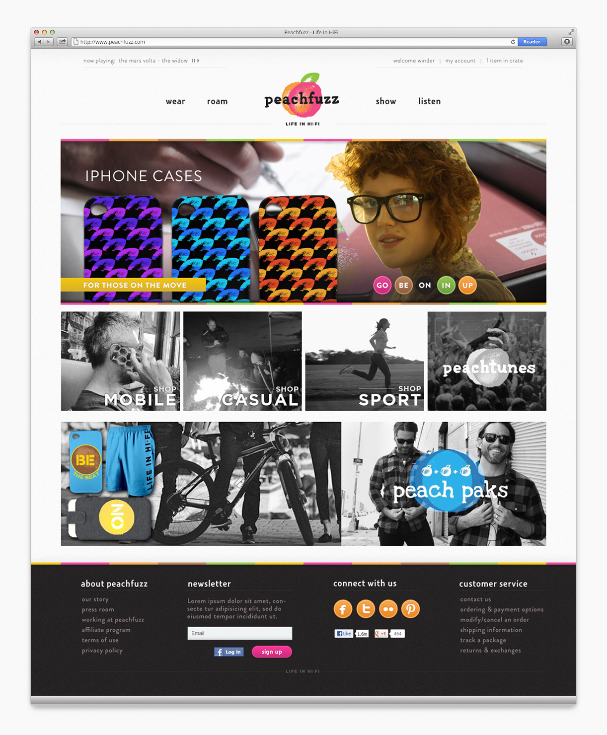
I ended up selecting Brandon Grotesque, a font that was distinguished enough to play off the fun logo.

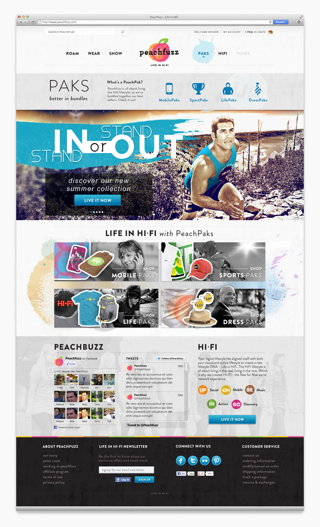
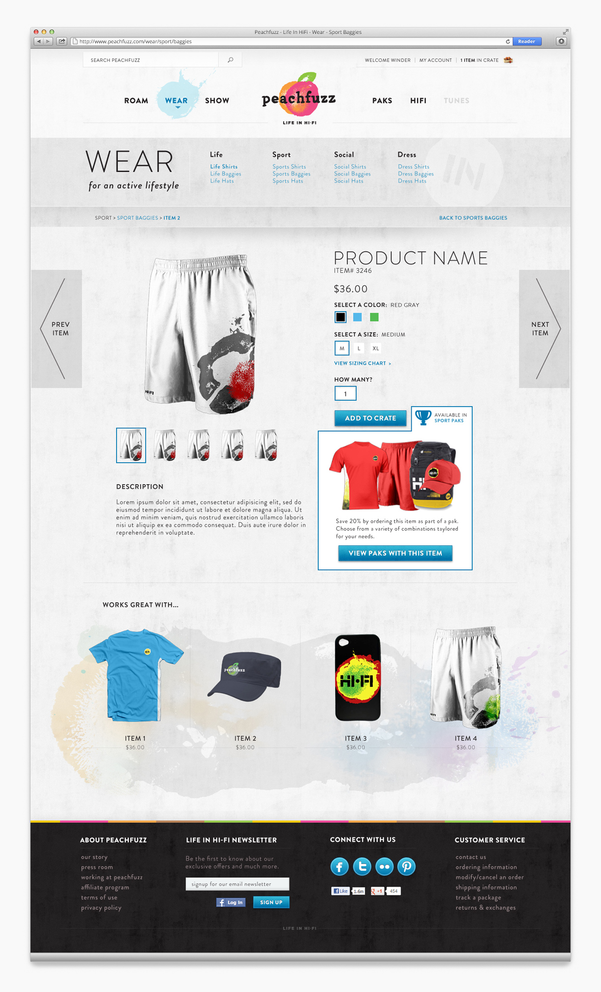
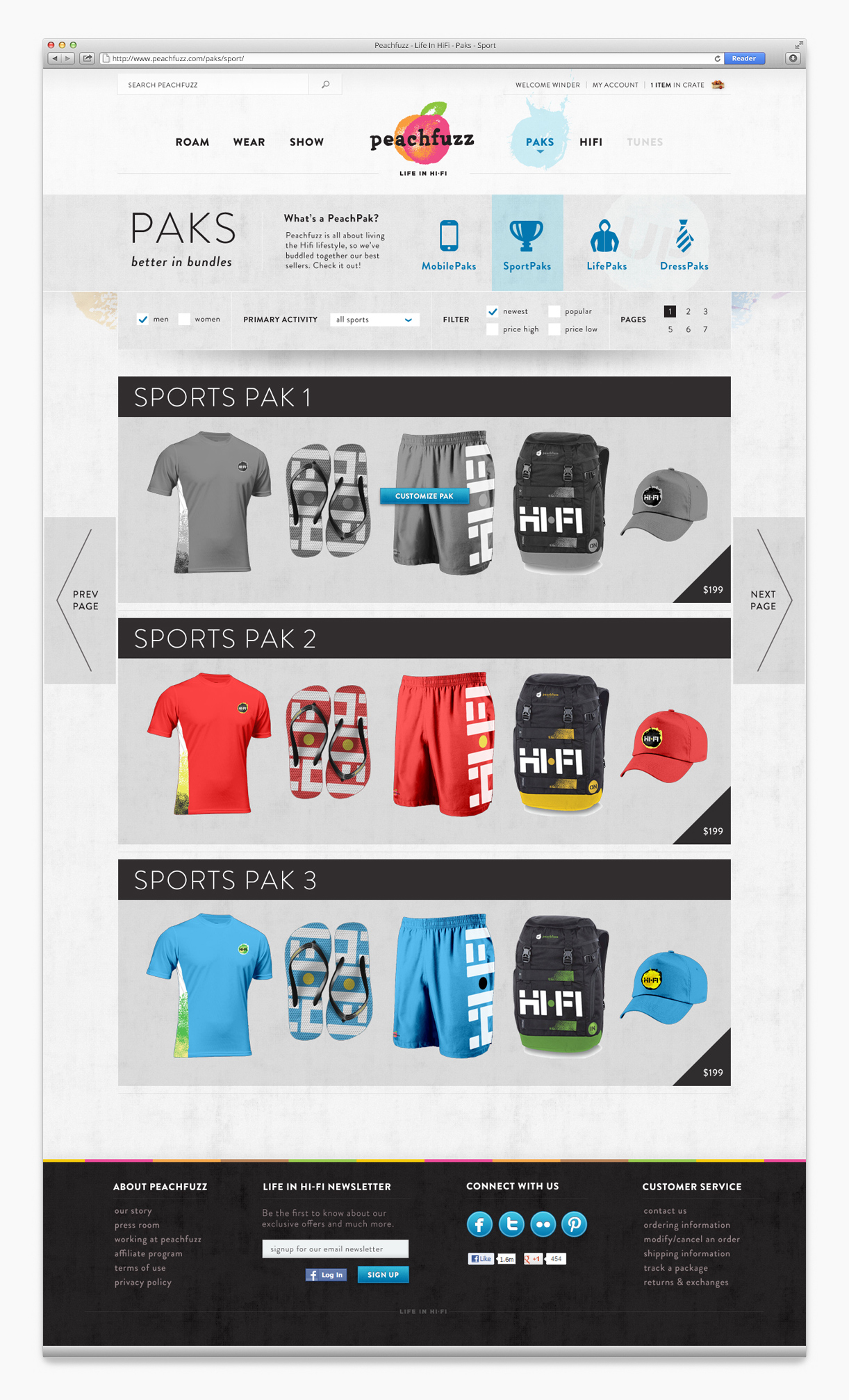
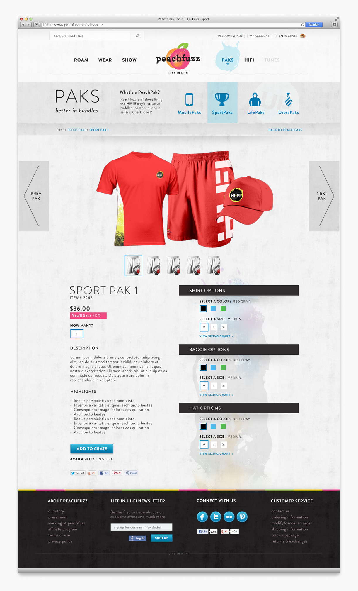
Another factor that came up was that we wanted to focus on selling PeachPaks, which were simply bundles of different merchandise based on lifestyles. We also wanted to emphasize the digital and social community we wanted to bring into the brand.
After a few rounds, I put together this landing page.
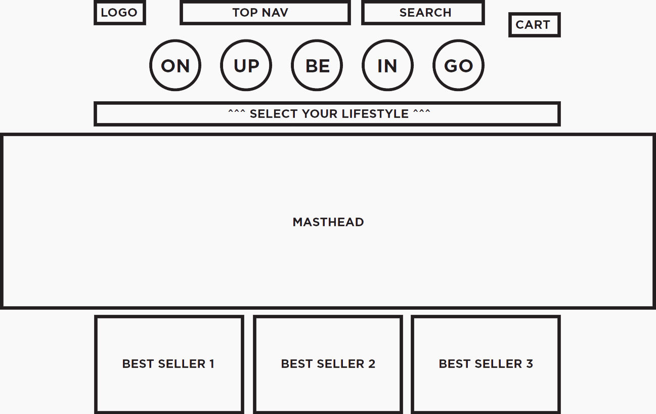
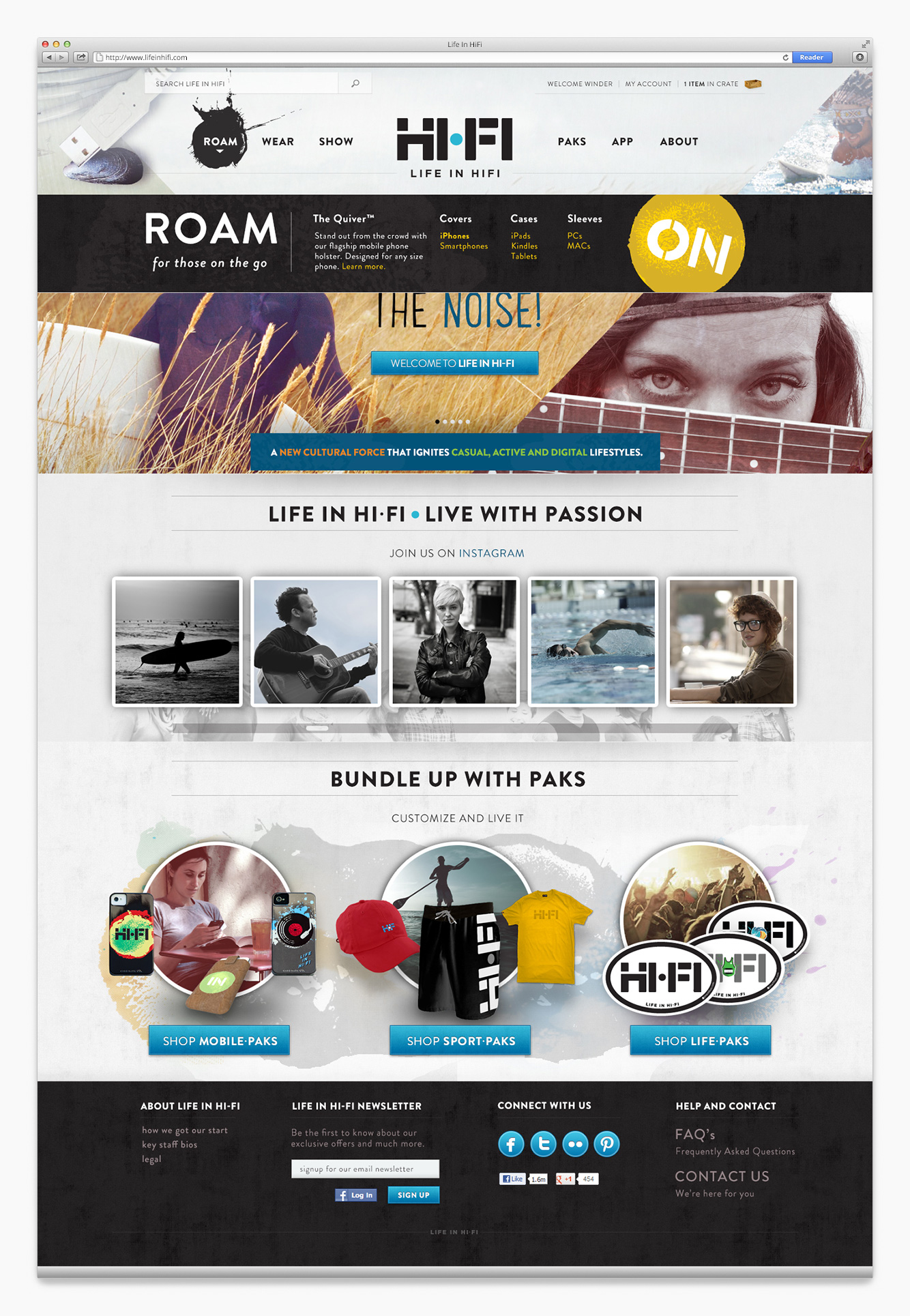
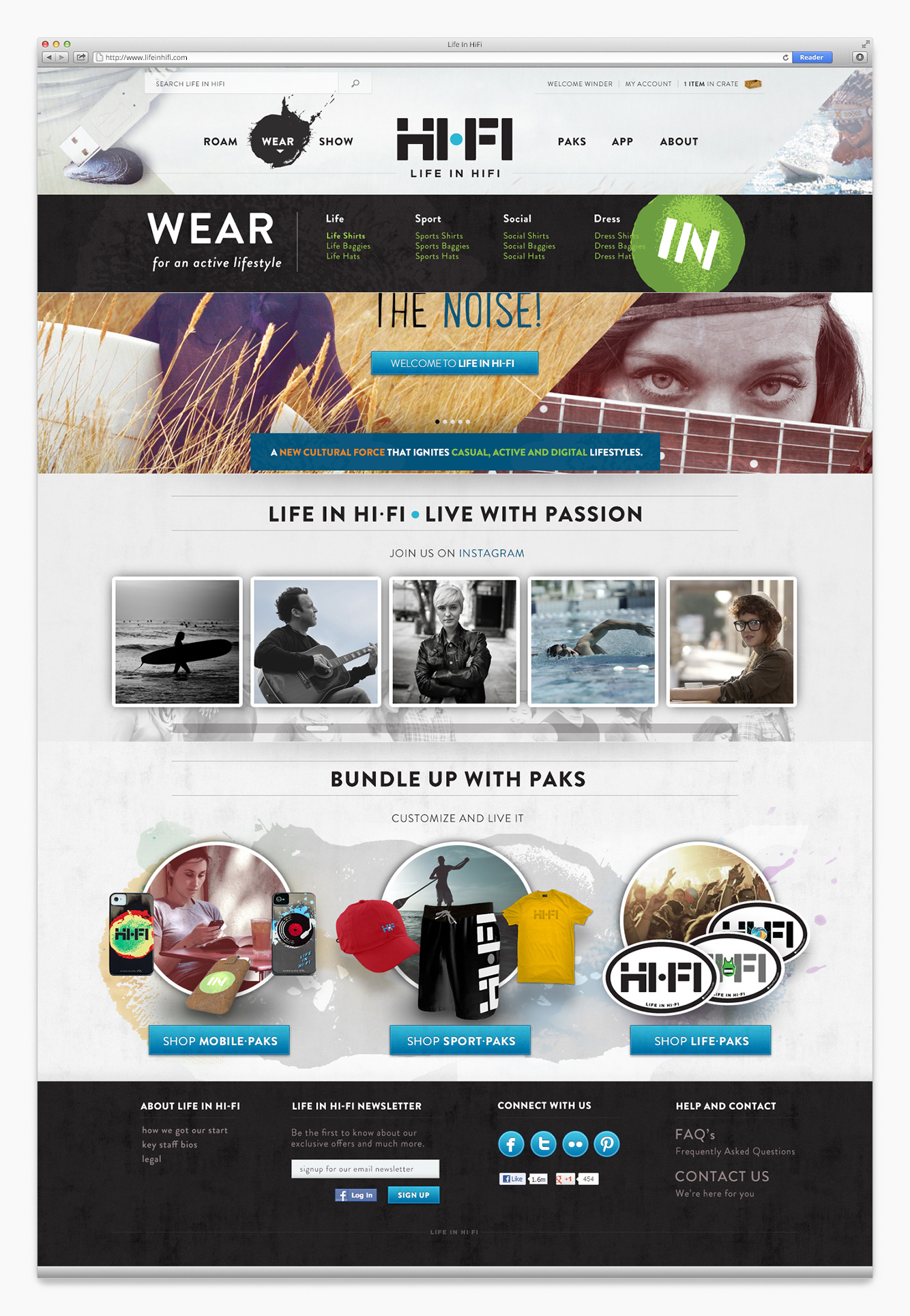
I really wanted the navigation to be more than a simple menu, so I began playing around with it.
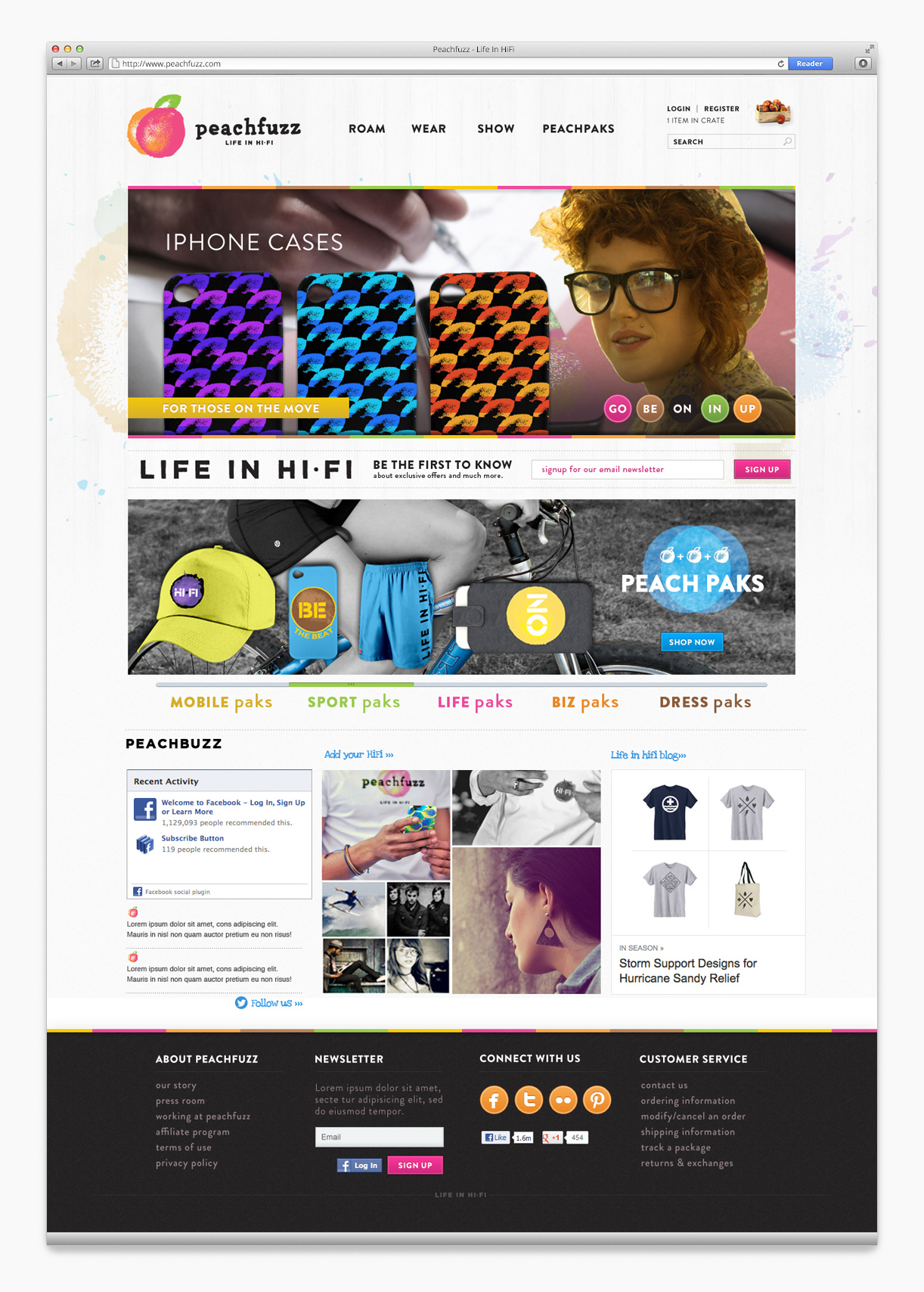
Once things were approved with the landing page, I began extensively mocking up the rest of the site. Take note that I tend to design these mockups so I can easily direct developers from a long distance away.
It was at this point in the process that we all took a step back to look at the brand overall.
After a number surveys, focus groups and user testing, the brand itself, Peachfuzz, was reimagined. We opted instead to use the tagline as the brand name.
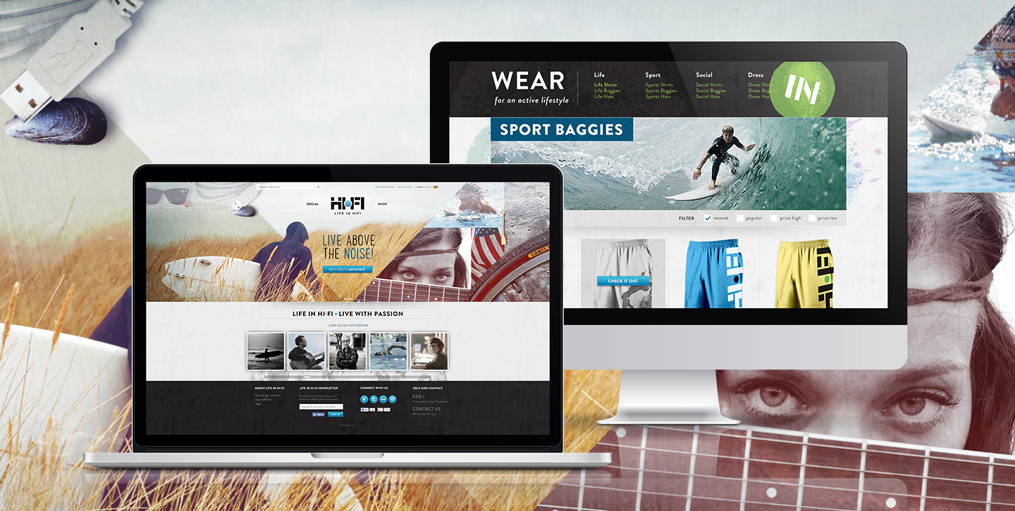
Thus, the brand became LIFE IN HIFI.
We were still an active lifestyle brand, however, we wanted to pursue a community around the brand more than just an eCommerce approach.
Since we wanted to push through this schism pretty quickly, Josh Hoye put together a simple combination brand mark.

Here is a variation of the brand mark.

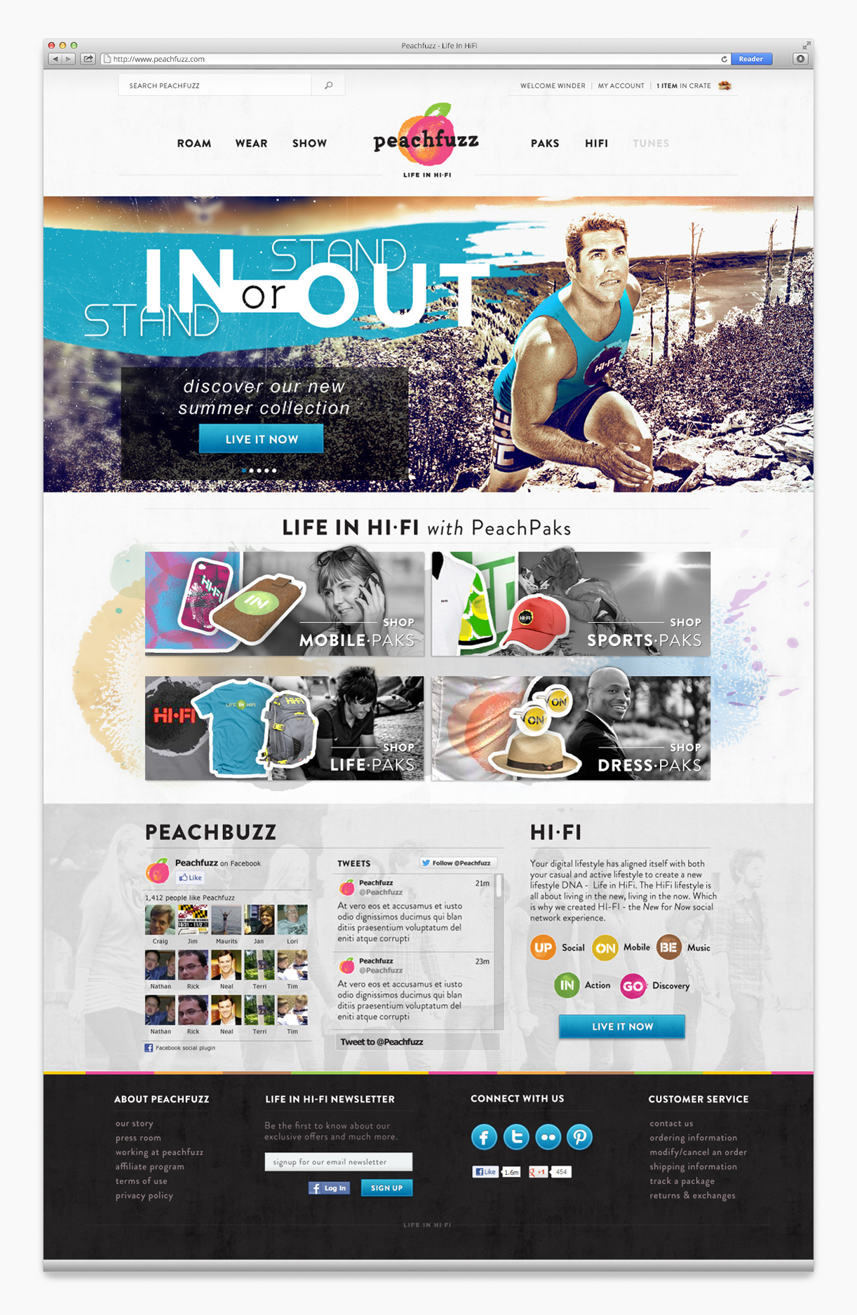
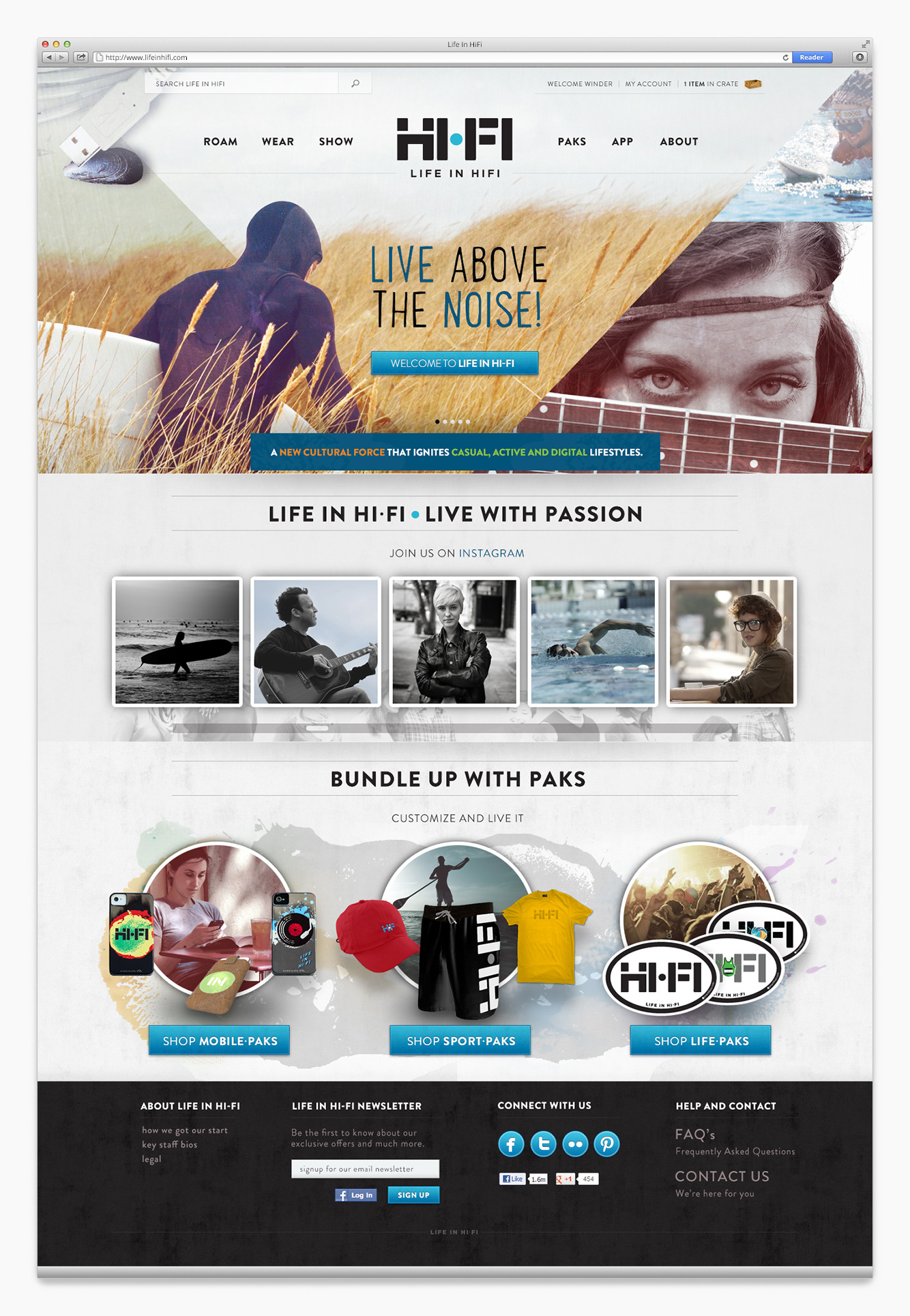
I then set about evolving the website to fit the new brand. This included changing colors, touching up the navigation and a few additional things. We wanted to bring this even more into the active lifestyle genre.
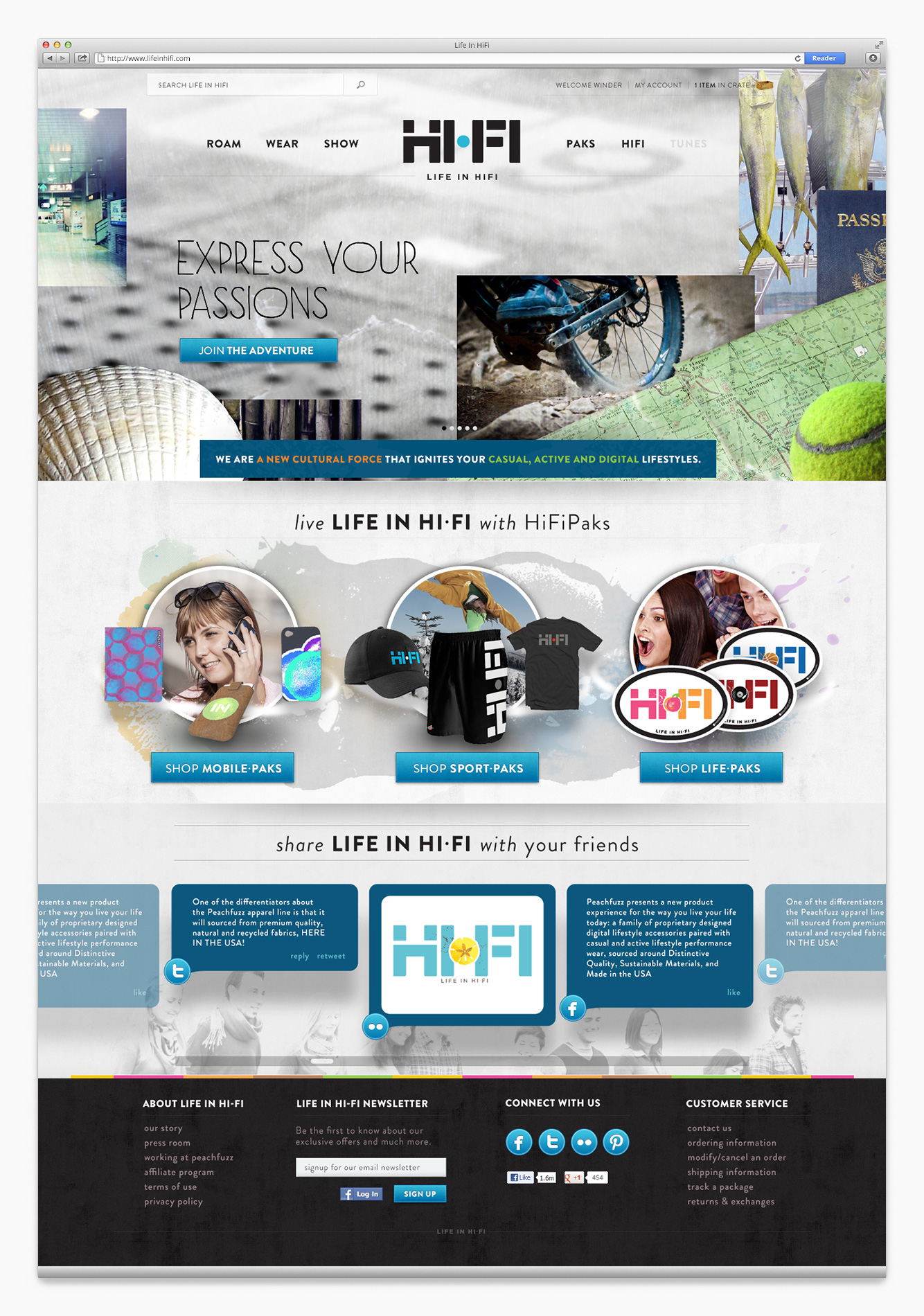
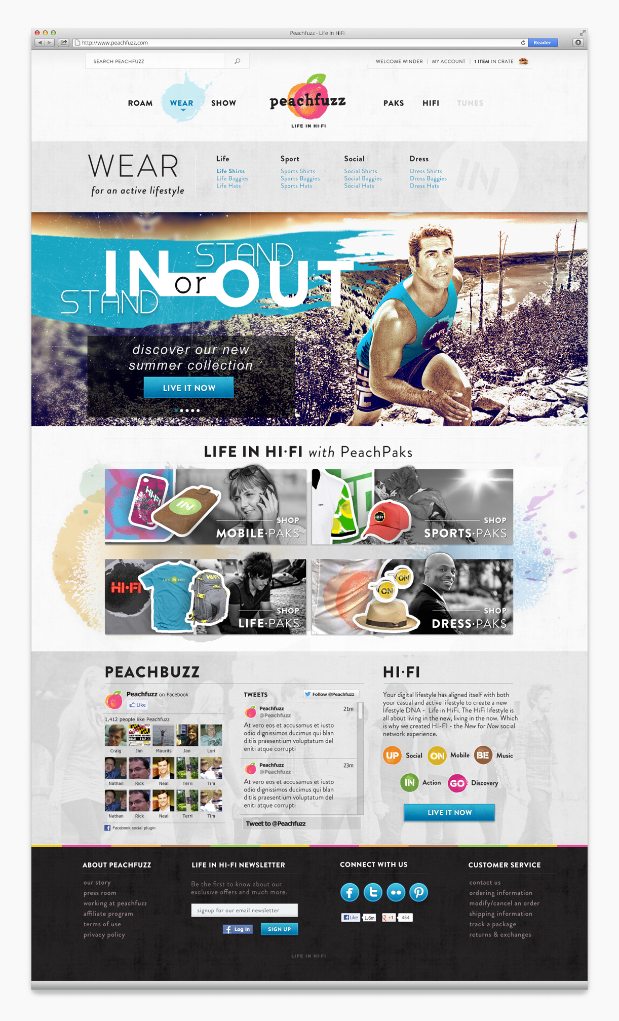
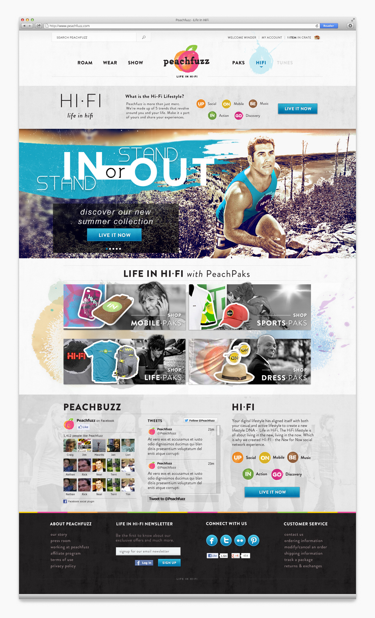
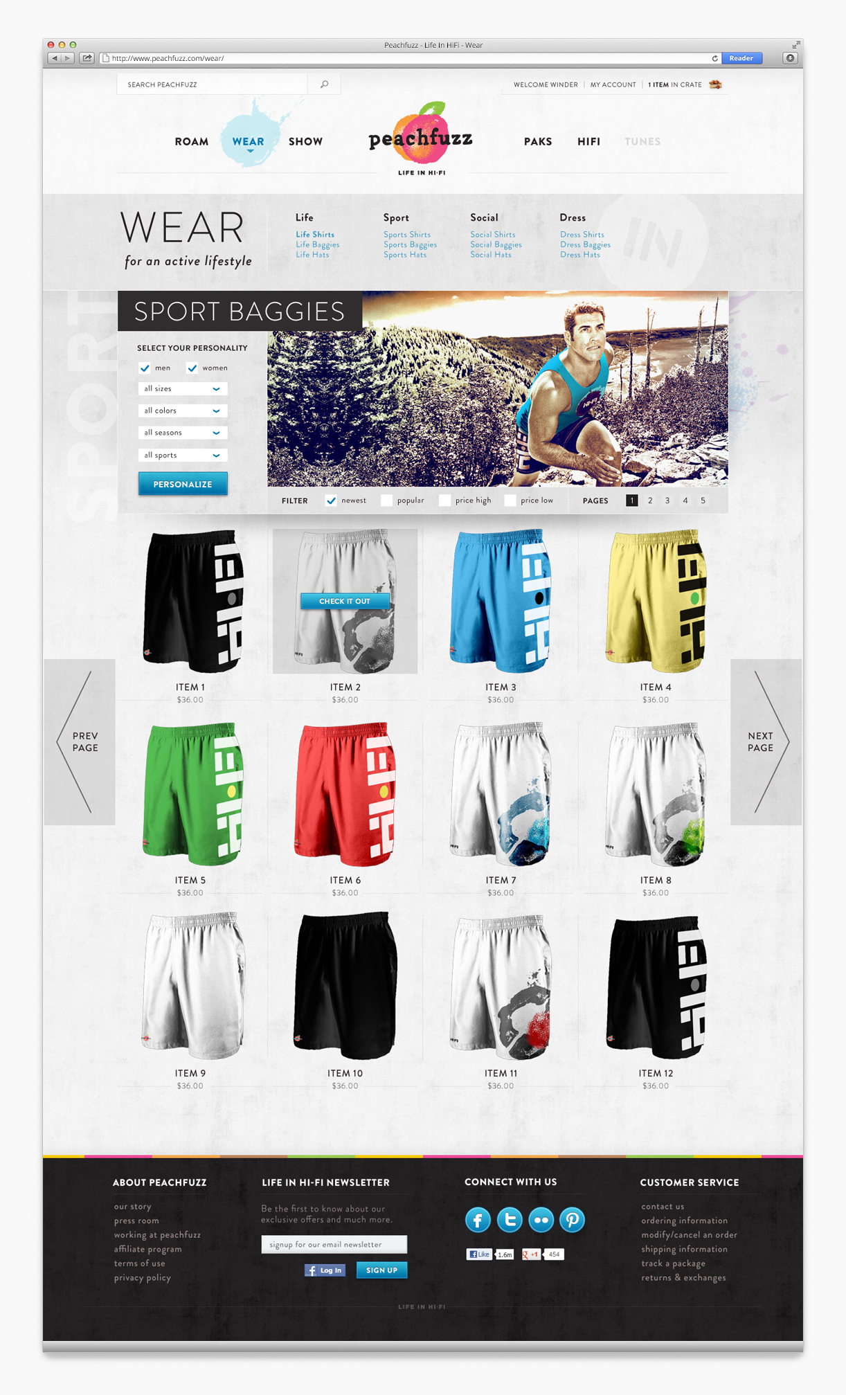
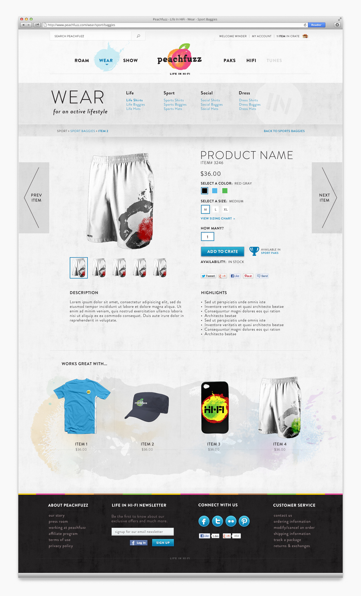
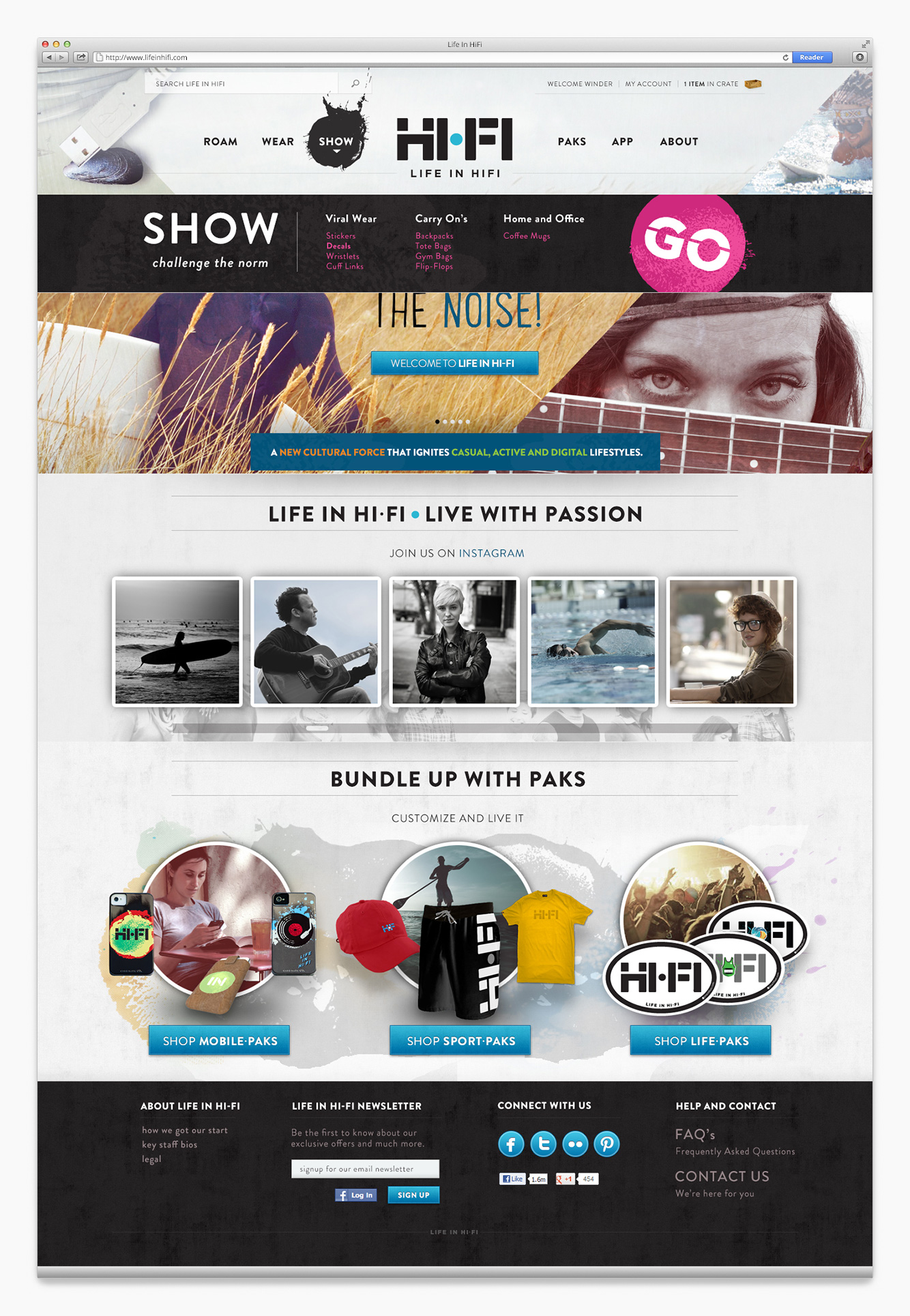
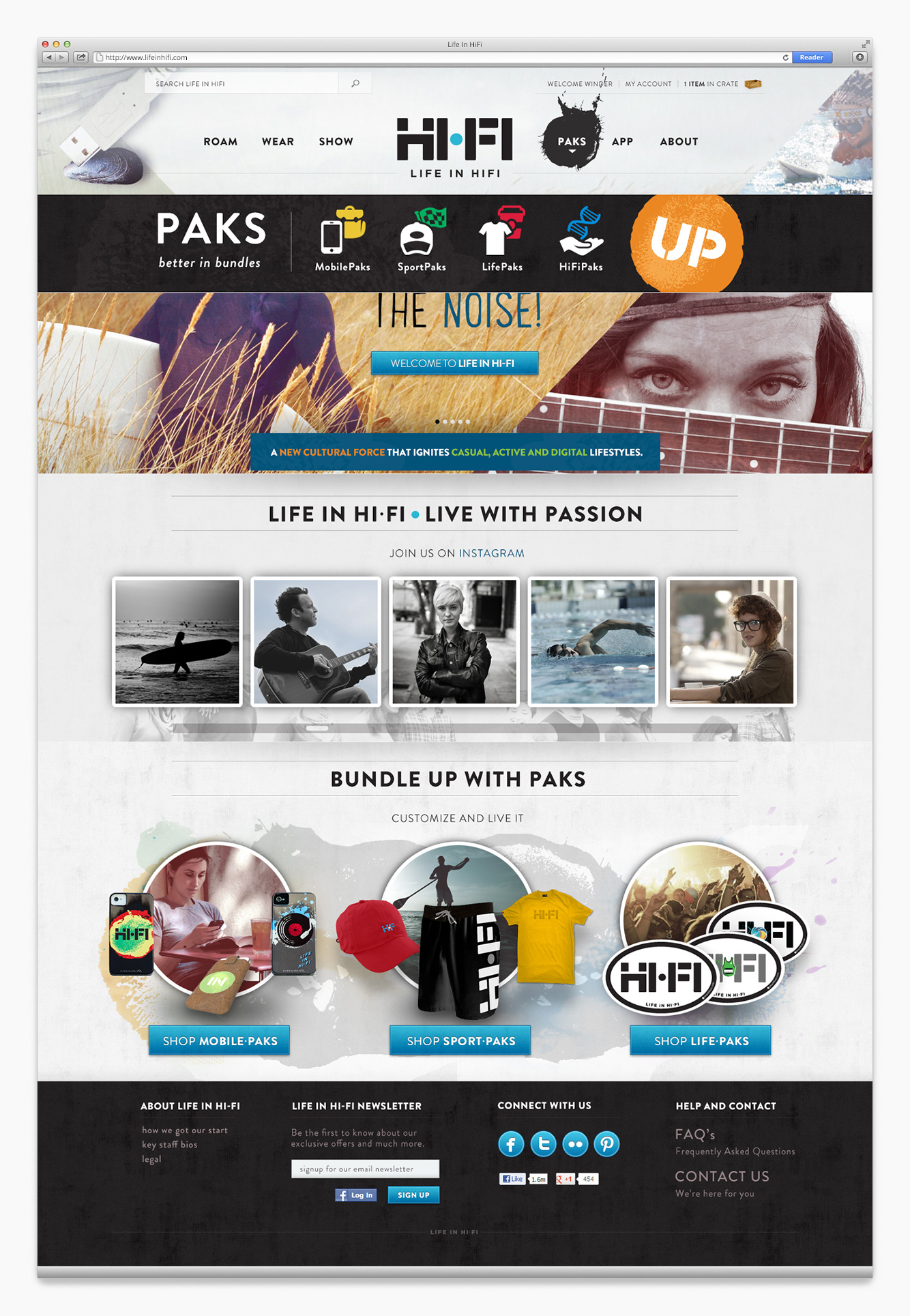
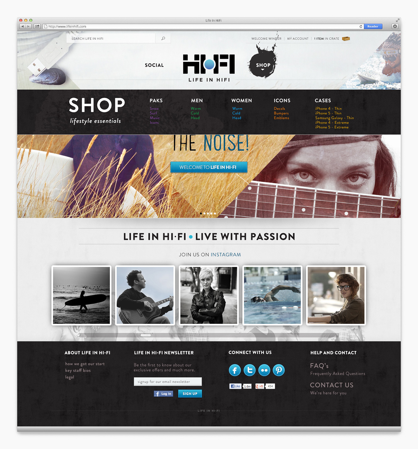
Here is a semi-final version of the eCommerce site including the navigation scheme.
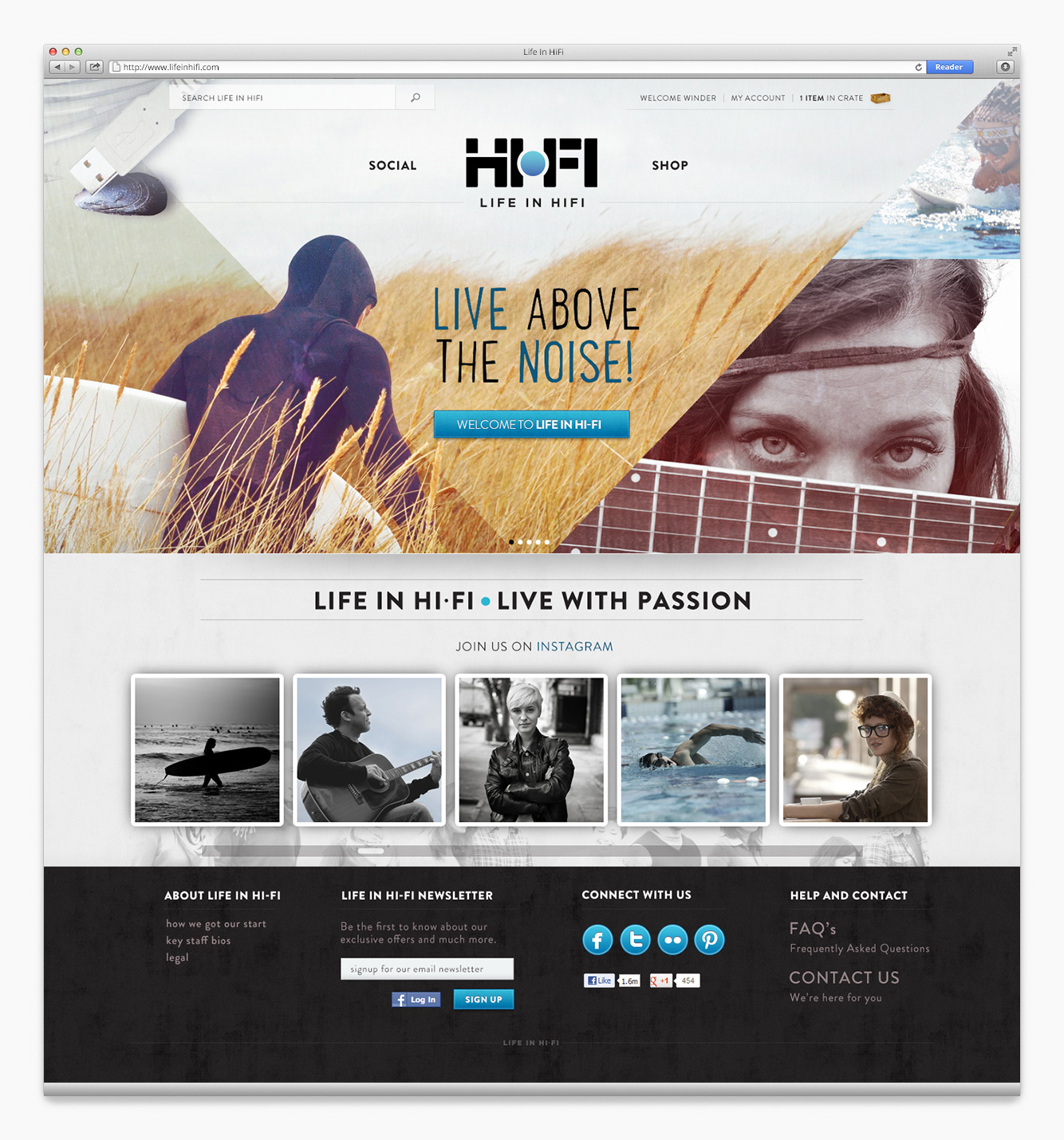
Since the schism, a social media aspect was starting to come to light. If we could resonate with a community before launching merchandise, then the brand would be more successful and have less competition amongst the many other apparel brands out there. Thus we reworked the landing page to focus primarily on the social aspect, leaning away from an eCommerce model to a social media platform.
This is the final version of the eCommerce site.
It was at this point I passed the torch to Josh Hoye, who took over developing the social media aspect and the brand as a whole. I continued on as a strategist, developing investor decks to help fund and maintain the brand direction. Working on LIFE IN HIFI was one of the best experiences I’ve had working on a brand. From it’s simple beginnings to watching it mature into something completely different. It was a true pleasure helping to develop something as exciting as LIFE IN HIFI.